They say you have about seven seconds to make a great first impression. It’s the same with your website. Google Research found that for users to engage and interact with your business, their experience with your website needs to resonate within one second. In another study, researchers found that your company has precisely 50 milliseconds to make an excellent first impression! This is a challenge, given that the human attention span continues to dwindle. A recent study by Microsoft found that the human attention span has dropped to eight seconds—shrinking nearly 25% in just a few years. That’s just one second shorter than the attention span of your average goldfish. Gaming software has a lot to do with this dropoff in our opinion.
So, what does that mean for your website? To convert, it needs to be visually attractive and quickly provide solutions to your customer’s pain points. That means you’ll need to lean into cutting-edge website design techniques that allow you to stand out from the competition.
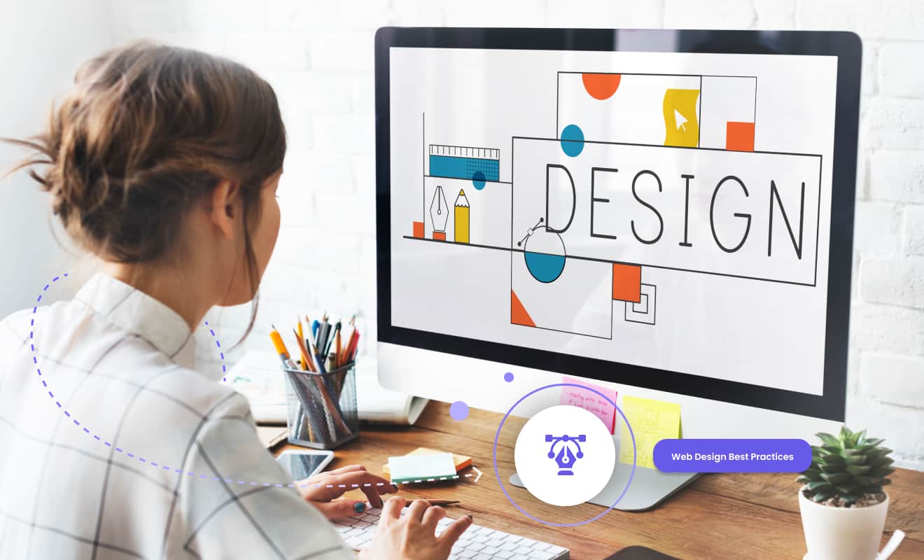
Here are the five best web design practices to help you transform your business and drive more sales.
Improve the user experience
Online customers can’t touch or try a product before purchasing it. That’s why the user experience (UX) is so critical. One way to improve UX is to add customer reviews to your pages. According to one report, 79% of respondents say they trusted online reviews as much as the recommendations of family and friends. In another study, 93% of consumers say online reviews influenced their purchase decisions. Another strategy is adding live chat customer support. This feature makes your customers feel supported and willing to pay more. In a 123FormBuilder recent survey, 68% of consumers said they would pay more for products and services from a brand that offers superior customer service experiences. You can also use data to provide personalized product recommendations. BCG found that when the shopping experience is personalized, customers are 40% more likely to spend more than they planned and 110% more likely to add additional items to their carts. It’s important to keep all potential users in mind when crafting a stellar user experience. 15% of the world’s population has some form of disability. This can hinder their ability to properly navigate your website if it isn’t designed with their unique needs in mind. It is therefore recommended to test your website for accessibility regularly.
Leverage high-quality imagery
Web users tend to have short attention spans and a low tolerance for text-heavy content. So, it’s not surprising that studies show that content with relevant images gets 94% more views than content without them. In addition, larger images convert at a higher rate than smaller ones. Including as many photos as possible showing different angles is also better. While you may need to occasionally use stock imagery, try to rely on original images to have a more significant impact on your audience. It can also be helpful to feature product images submitted by customers or clients. User-generated content inspires others to buy, lends authenticity to your product, and helps build brand confidence. Another way to bring products to life is by leveraging 3D visuals or AR/VR. When tested by home improvement store Lowes, how-to videos they showed in VR had a 36% higher recall than videos featured on YouTube.
Incorporate actionable CTAs
Of all the website elements we have discussed, creating prominent CTAs is one of the most critical. Make sure your CTA stands out by:
- Putting it above the fold
Your CTA should be easy to see and understand. Set it apart from the other text by adding space and making it large and distinct. Make sure it is above the fold for maximum visibility.
- Including a value proposition
The first thing people notice on your website is the value proposition. Ideally, it is something unique that your competitors aren’t offering. It could be a free book or savings suggestion like, “save 30% today only.” That way, you add value while creating urgency.
- Experimenting with color
The color of your CTA button and text could be the most critical factor in driving additional conversions. Also, ensure that the button remains an appealing part of your design while prominent. Test several options to see which work well with your target audience.
- Using action-oriented text
Don’t forget that your CTA is a call to action. When crafting action-oriented text, focus on what you want the customer to do. For example, you can increase click-through rates by using first-person phrasing like “Start my free 30-day trial” versus “Start your 30-day trial.”
- Adding a sense of urgency
Scarcity is one of the most effective conversion strategies because products selling out quickly make users want to buy immediately. Another way to incent visitors to make a purchase is to include elements next to the CTA that create a sense of urgency. Examples include low stock indicators, current viewers, recent purchases, and sale end dates.
Use consistent branding
Your brand encompasses what you stand for, who you serve, and why you do what you do. That brand promise needs to be infused across your entire website. Make sure your color scheme and logo remain consistent. The same is true for your brand voice and key messaging. A consistent tone on each page builds trust with customers and will make your brand more memorable. It will also go a long way in building brand equity.
Design for mobile-first
According to research, mobile devices make up 54.4% of global website traffic. So, designing with mobile-first in mind should be a priority. While it may sound obvious, don’t forget to make the text large enough to read and use large buttons. Also, given the lack of space, simplify navigation menus. Most mobile-friendly sites use two or three horizontal lines to indicate a menu. If you have forms, make them a bit shorter. Users may be okay with filling out a longer form on their laptops but not mobile phones. Finally, avoid pop-ups. In 2017, Google introduced a policy that targets explicitly intrusive interstitials, which could cause your mobile page to be devalued. Not to mention the fact that most people hate them.
Don’t wait to give your website visitors an enjoyable shopping experience that translates into higher sales. By leveraging these web design best practices, your traffic and conversions will skyrocket.