How to Design an eCommerce Checkout Flow and Close More Sales
Nico
is the founder of Crunch Marketing and
LauchSpace. The company works with enterprise SaaS clients, helping them scale lead generation globally across EMEA, APAC, and other regions.
8 minute read
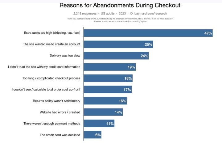
A staggering 70% of online shoppers find themselves abandoning their carts. But what drives this widespread reluctance?
Apart from the high shipping costs and slow deliveries, the culprit may be simpler than we think. Almost 25% of those who abandoned their carts didn’t like the fact that the site wanted them to create an account. Then there’s the 18% of consumers who said the entire process of checkout was too long.
In other words, the problem may be your eCommerce checkout flow.
Any eCommerce business looking to thrive needs a seamless checkout flow. Want to know how to make the checkout experience better? Let’s start from the top:
What is an eCommerce Checkout Flow?
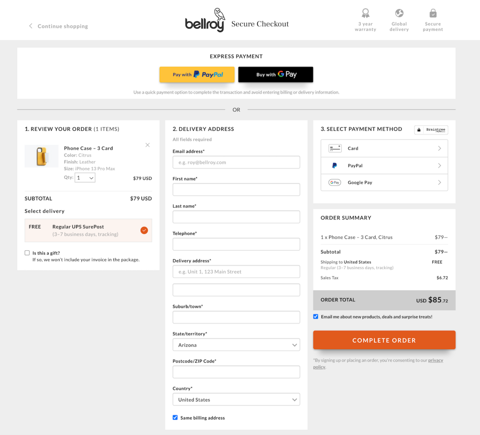
Think of the checkout flow as the path from picking something out to buying it. It starts when a potential customer adds something to their online cart and ends with their payment. See a sample eCommerce checkout flow below:
There isn’t really a hard-and-fast rule for how many steps an eCommerce checkout flow should have. However, research by Baymard found that the average checkout flow for a new user is 5.1 steps long. This number has remained somewhat unchanged since Baymard started tracking the number of checkout steps implemented by major e-commerce sites.
Whatever the number of steps you opt for, what’s clear is this: an eCommerce checkout flow with minimal steps is the way to go. A staggering 66% of consumers expect the entire checkout process to take only four minutes or less.
4 Best Practices to Design Your eCommerce Checkout for Higher Sales
So, how can you transform your checkout experience for higher conversion rates and customer satisfaction? Follow these tips:
1. Offer Guest Checkout
Guest checkouts ensure customers aren’t bogged down by an extra series of steps. With a guest checkout option, your potential buyers won’t have to go through the hassle of creating an account just to buy from you. In other words, guest checkouts are key to ensuring a seamless ecommerce checkout flow that can boost sales.
It’s not surprising that 43% of online shoppers prefer checking out as guests and 94% of Shopify sites have a guest checkout option.
The guest checkout option should be shown alongside the create-an-account option. This will help ensure customers don’t feel pressured to go the long route.
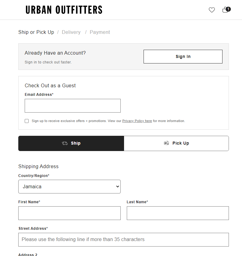
Also, follow in the footsteps of Urban Outfitters. Notice below that the site only asks for essentials like the email address (and shipping details, of course) to complete an order via guest checkout. Asking for too many details would defeat the purpose of offering the option in the first place.
Just make sure you verify email addresses if you ask for only this contact information. This will help ensure your subsequent confirmation emails reach the intended recipients.
You can also offer buyers the option of checking out as a guest by signing into their preferred social media accounts.
Beyond easing the checkout process for ordinary buyers, guest checkout caters to impulse buyers who make unplanned purchases. The speed and convenience help them consummate the action.
2. Provide Multiple Payment Options
Imagine this scenario: You find your ideal product, put it in the cart, and have all your credit card details ready. But when you get to the checkout page, you don’t find a credit card option. As a buyer, it’s frustrating, right? Since the eCommerce checkout flow isn’t smooth (in fact, it’s hampered), you’ll end up not buying at all.
When you give buyers multiple payment alternatives, you ensure your customers complete the buying experience.
Apart from credit cards, here are some payment options you might want to include in your eCommerce checkout page:
Digital Wallets: Apple Pay, PayPal, and Google Pay are some popular digital wallets. They are secure, convenient, and easy to use.
Buy Now, Pay Later (BNPL): BNPL is a fantastic way to encourage sales without pushing customers to spend too much. Adding BNPL to your checkout is simple. You can partner with popular services like Afterpay or Klarna. Just sign up with your chosen provider.
Location-Based Payment Methods: Having payment methods that cater to potential buyers outside your geographical area can make a big difference since they open up your business to a new market. For instance, by offering Alipay, you can cater to customers in China.
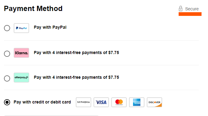
Apart from offering multiple payment options, make sure your page displays a padlock trust seal, like the Sephora page below:
If you think about it, in a way, the display of security badges can also help ensure a seamless checkout process. When eCommerce shoppers feel the site offers a secure checkout, they won’t hesitate to enter the payment details required for the purchase and press that buy or check out button.
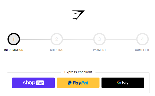
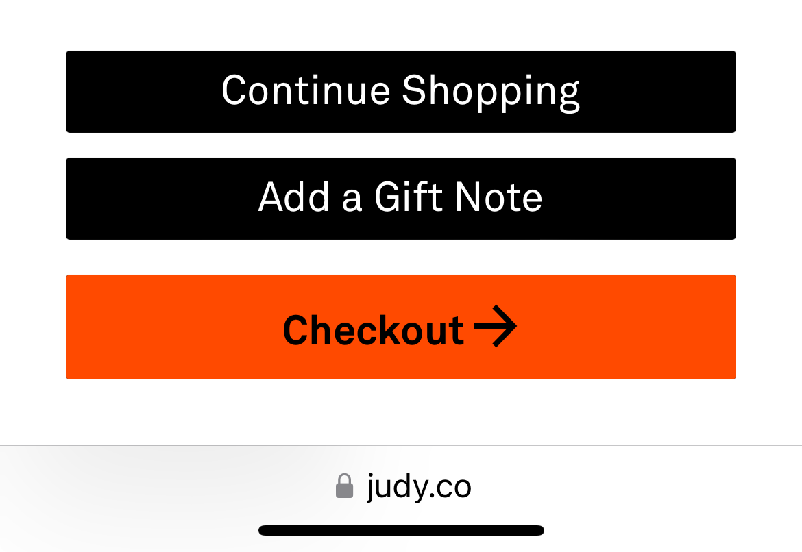
3. Reduce Distractions and Friction
A checkout page design with too much going on can confuse customers and make them leave without buying anything. By improving your checkout page, you can ensure a smooth buying experience from start to finish.
Here’s how you can make your checkout page experience distraction-free and frictionless enough to keep your customers on track to making a purchase.
Ensure a Clean Interface: Remove extra menus, too many product suggestions, and anything else that doesn’t have to do with your primary page purpose: to get visitors to consummate the purchase. Look at how Nike does it:
Don’t worry. You don’t need to know how to code to create these pages. There are tools available for this. Leadpages, for instance, is a famous drag-and-drop page builder. But if you think this is expensive, there are alternatives to Leadpages you can always consider.
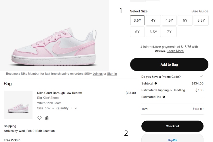
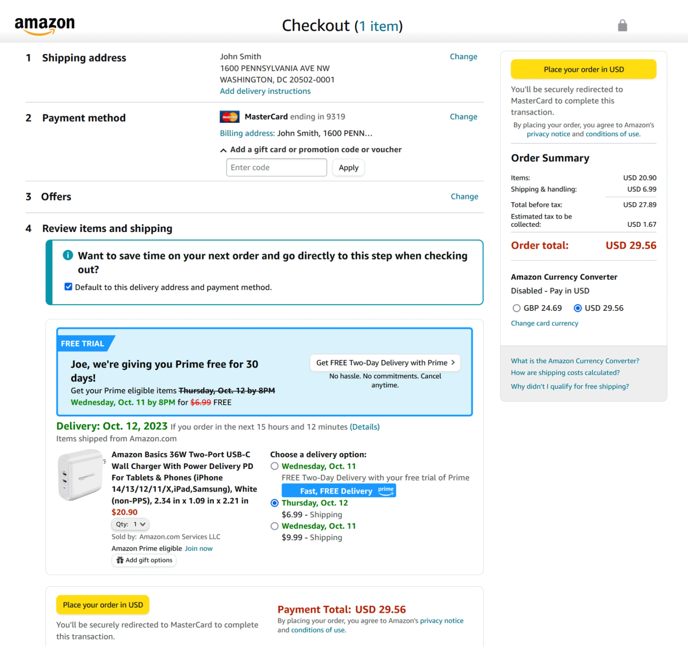
Give Clear Instructions: Make sure it’s easy for your customers to understand what to do at each step. Simple instructions are key to ensuring your customers keep going until they buy. Amazon excels at this. Notice the simple language used on their checkout page:
AutoFill: This applies if your visitor already made a previous purchase from you. Using what you already know about your customers (like their email address or preferred method of payment) can make checking out faster. That’s because your customers don’t need to re-enter all the data you require in the form fields.
As a final tip, why not show customers how far they are in the checkout journey? This can help reduce friction in a way. With a visible progress bar, you can reassure buyers that they’re only a few steps away from completing the purchase. So, they’ll likely just focus on the task at hand to get to that goal.
Major online sites like Gymshark (see above) leverage this page element during checkout. For the progress bar to work, though, again, you shouldn’t have too many steps in your online checkout process. If potential customers see there’s still a lot to do, they’ll likely leave your page without making a purchase.
4. Optimize Site for Mobile Devices
By 2027, sales from mobile commerce are predicted to hit an impressive $856 billion. This means the eCommerce trend is for people to use their phones to shop. So, when designing your eCommerce checkout flow, you want to optimize your site for mobile as well. This will help ensure buyers, particularly those who prefer mobile checkout, complete the purchase process.
Here are some tips for mobile optimization:
Make CTA Buttons Big: Your checkout buttons like ‘Add to Online Shopping Cart’ and ‘Check Out’ should be big enough to tap easily when using a small device. They should also be visible from a small screen.
So, as in the examples above, make sure there’s enough white space around these buttons as well.
Make Your Site Responsive: Implement a responsive design to make sure your online site will automatically change to fit any screen, whether it’s a phone, tablet, or computer screen.
Optimize Images: Optimize your pictures so they’ll load quickly on mobile. Don’t upload images larger than 1MB. As for dimensions, aim for a maximum of 2000 px. Also, use faster-loading image formats. JPEG is best suited for colorful pictures on mobile since they’re small in size and can shrink even more with lossy compression. You can also use modern image formats such as WebP and AVIF.
You can use Google’s Mobile-Friendly Test to check if your eCommerce site is mobile-friendly. The tool can also give you recommendations to improve mobile responsiveness.
In Closing
The key to boosting your online sales is a simple eCommerce checkout flow. You must ensure a clear path for consumers from the time they add items to the cart to that time they click “buy.” If you don’t, they’ll likely just go to your competitors and complete their online purchases there.
You’ve learned the key strategies to make this happen. Offer guest checkout options so customers don’t have to go through the hassle of creating an account. Also, provide multiple payment methods. Don’t forget to reduce distractions on your checkout page and ensure a frictionless experience. Also, make sure you optimize your site for mobile to ensure mobile users complete their purchases.
Now go forth and enhance the buying experience for your potential customers. You’ll, ultimately, ensure business growth. Best of luck!